EVENTLIN
Bringing clarity to hospitality bookings
Starting point
I joined Eventlin when the product was already in the market, with a solid customer base across the Balkans. The next step was bigger: move customers and prepare the product for the world market.
Outcome
The redesign turned Eventlin from a MVP into a confident, cohesive product. / <5min onboarding time / +28% activation / −40% support requests / 3× faster setup
Info
Tools: Figma & Framer; Time: 2025; Role: Designer, no-code developer
EVENTLIN
Bringing clarity to hospitality bookings
Starting point
I joined Eventlin when the product was already in the market, with a solid customer base across the Balkans. The next step was bigger: move customers and prepare the product for the world market.
Outcome
The redesign turned Eventlin from a MVP into a confident, cohesive product. / <5min onboarding time / +28% activation / −40% support requests / 3× faster setup
Info
Tools: Figma & Framer; Time: 2025; Role: Designer, no-code developer
Problem
The cracks started to show in daily use
The product had grown faster than its foundations.
Navigation was confusing. Bugs and broken flows appeared across the product. Users could make irreversible mistakes without enough guidance.
The founders were still onboarding and educating every customer themselves. That worked while the customer base was small. It stopped working as the product grew.
The first steps I took:
1
I mapped the key user journeys and ran a UX audit across the product
2
Accessibility issues identified and fixed
3
Navigation and interaction patterns cleaned up
4
Three visual themes created
5
Three visual themes created
5
Built marketing website to match the new direction


next steps
The scope gets bigger
The founders were still onboarding and educating every customer themselves.
It worked at a small scale. It could not work at the next one.
Building v2:
1
Improved onboarding flow
2
Redesigned the product and created a self-serve setup
3
Design system systematized
4
Worked on "Lina", AI coworker


summarum
Designing for everyday use
01
Product cleanup
Simplified key journeys, navigation and core workflows. Created a more consistent and scalable interface across the product.
02
Mobile
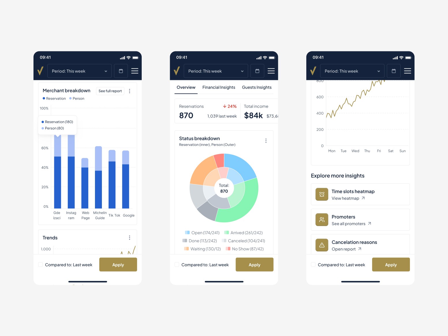
Reworked the mobile experience, making it cleaner and easier for hosts and staff to manage bookings on the go.
03
Design system
Created a full design system for both light and dark themes, setting a scalable foundation for future product growth.
04
Website
Designed and developed a new marketing website in Framer, rewriting the information architecture and copy to tell a clear story of the product.
05
Brand
Systematized the brand, consolidating all previous assets and guidelines into a single, cohesive brand book.
Outcomes
The redesign improved usability, consistency, and perception
The design system now drives all new features, the website aligns the product story, and the overall experience feels reliable and modern.
This work laid the foundation for scalability — enabling faster workflows, fewer mistakes, and a stronger sense of trust in the brand.
Problem
The cracks started to show in daily use
The product had grown faster than its foundations.
Navigation was confusing. Bugs and broken flows appeared across the product. Users could make irreversible mistakes without enough guidance.
The founders were still onboarding and educating every customer themselves. That worked while the customer base was small. It stopped working as the product grew.
The first steps I took:
1
I mapped the key user journeys and ran a UX audit across the product
2
Accessibility issues identified and fixed
3
Navigation and interaction patterns cleaned up
4
Three visual themes created
5
Three visual themes created
5
Built marketing website to match the new direction


next steps
The scope gets bigger
The founders were still onboarding and educating every customer themselves.
It worked at a small scale. It could not work at the next one.
Building v2:
1
Improved onboarding flow
2
Redesigned the product and created a self-serve setup
3
Design system systematized
4
Worked on "Lina", AI coworker


summarum
Designing for everyday use
01
Product cleanup
Simplified key journeys, navigation and core workflows. Created a more consistent and scalable interface across the product.
02
Mobile
Reworked the mobile experience, making it cleaner and easier for hosts and staff to manage bookings on the go.
03
Design system
Created a full design system for both light and dark themes, setting a scalable foundation for future product growth.
04
Website
Designed and developed a new marketing website in Framer, rewriting the information architecture and copy to tell a clear story of the product.
05
Brand
Systematized the brand, consolidating all previous assets and guidelines into a single, cohesive brand book.
Outcomes
The redesign improved usability, consistency, and perception
The design system now drives all new features, the website aligns the product story, and the overall experience feels reliable and modern.
This work laid the foundation for scalability — enabling faster workflows, fewer mistakes, and a stronger sense of trust in the brand.
Menu
Belgrade, Serbia.
© 2026
Working from Belgrade, Serbia.
© 2026
Belgrade, Serbia.
© 2026
Working from Belgrade, Serbia.
© 2026